A CMS overhaul for the California Symphony
Rethinking content, design, and automation to make the most of a shoestring budget
The California Symphony came to Mission Minded with a goal of aligning their web experience to the organization’s new strategic plan initiatives. For the symphony, this meant engaging younger and more diverse audiences in their community.
To do this, we designed and built a new WordPress website from the ground up: addressing new patrons’ curiosity for a peek at the symphony experience, and creating an integrated design system in the back end that enabled resource-strapped staff to easily maintain the site.
Client The California Symphony
Agency Mission Minded
The Team A brand and web strategist, project manager, and myself working closely with the client’s internal team
My role
Led stakeholder workshops
Collaborated on site architecture
Created low fidelity interactive prototype
Designed high fidelity web interface
Produced HTML/CSS/JS
Built highly customized WordPress theme
Site governance Client continues to maintain the site
Research & Strategy
We had a head start on discovery for this project — our client had just completed a series of focus groups aimed at uncovering some of the hurdles faced when seeking to invite new, diverse, and younger audiences to the live performing arts.
Our work began with stakeholder workshops, and 6 interviews with both current and potential patrons of the symphony who fell into our target demographic. Our aim with these interviews was to give shape to some of the ideas that had come out of the focus groups and to inform a web strategy document that would shape the direction of the project.
Challenges & Opportunities
We found a several areas that posed challenges, both to end-users of the site, and also for the staff charged with maintaining the site:
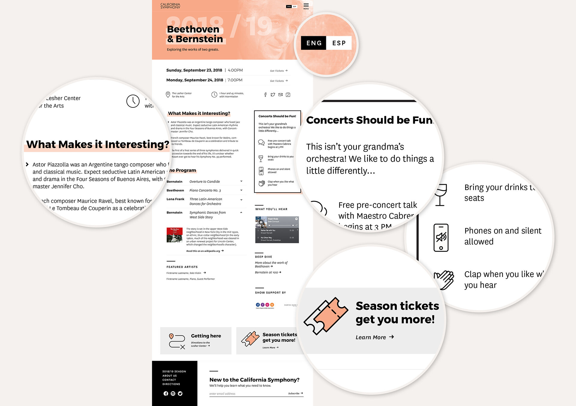
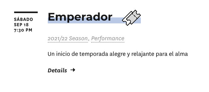
Content did not speak to potential patrons. New and potential patrons were seeking more information about the symphony experience before making a ticket purchase. They wondered what they’d be getting into and whether they’d feel out of place. The outdated design of the site contributed to feelings that the symphony was “stodgy”. For some potential patrons, this was a literal language problem, as the site was available only in English.
Show details and ticket information was difficult to find. Current patrons found it difficult to quickly find ticket options and to find a preview of the entire season before opting into a season ticket package. Many ended up calling the box office to ask questions and buy tickets, placing more strain on staff.
Current CMS implementation was a barrier to keeping content up to date and visually consistent. Staff members who were in charge of maintaining the site were not design or tech-savvy and had trouble keeping content up to date, often relying on freelance designers who were contributing to fracturing the visual consistency.
Strategy & Sitemap Ideation
Armed with our findings, I led a card sorting workshop with the client to gather and organize ideas for addressing some of the gaps in information site users were having.
The outcome of this session was a sitemap with a few specifics to address the pain points we had heard:
A “Plan your Visit” section with a plain language FAQ page.
A quick path to showcase details for the current season through a “Current Season” landing page in addition to the main calendar.


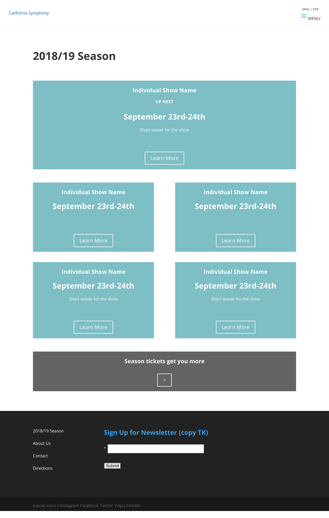

Lo-fi WordPress Prototype
As we moved into wireframes, the client was eager to understand how various parts of the site fit together: in particular how the same show detail page could power information on both the season landing page and the calendar. This was critical in keeping the workload low for staff who would be maintaining the site.
I opted to create a very lo-fi prototype in WordPress itself, rather than a more detailed static wireframe or InVision prototype, so the client could more accurately preview the click-through experience as it would exist on the live site.
Early Exploration


Visual design with site maintenance in mind
I had two main challenges to solve with visual design:
Lack of design resources and assets. The Symphony did not have a robust archive of images, or the budget to bring a photo library up to date. There were also no designers on staff, so any proposed design system needed to be easy to use for non-designers working with limited image assets.
A changing color palette. The Symphony had an immovable tradition of adopting a new color palette for each new season’s marketing materials, meaning that any design needed to accommodate a changing color scheme without sacrificing visual consistency.

Keeping it simple
To address both challenges, I created a system that draws its identity from monochrome black and white typography rather than photography or specific illustration style.
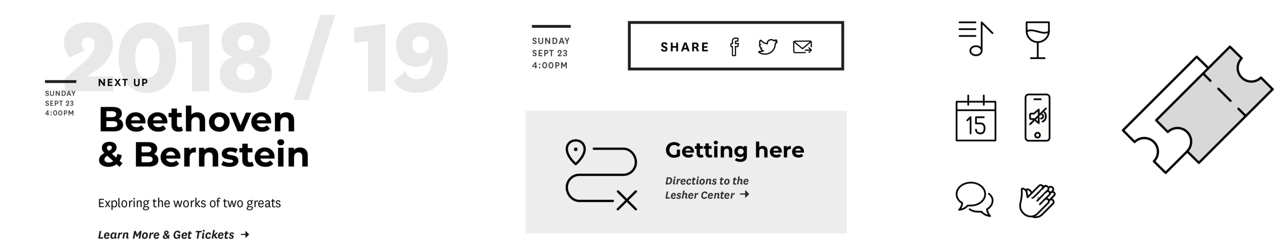
The system leans heavily on an easy-to-extend set of icons and simple elements like a thick border style to create consistency without requiring a set color palette or complicated design elements.
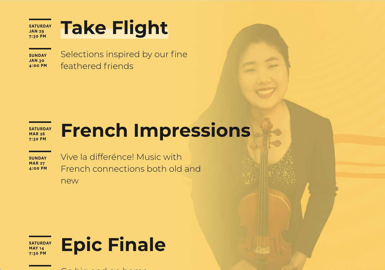
Flexible color and hero images
While the base of the system is monochrome, I wanted to allow some room for the season color palettes to be brought in. Each show of the season was assigned a color, so my idea was to keep this streamlined by allowing only one “highlight” color at a time, to be based on the next upcoming show. On the back-end, I built the theme to process this automatically, requiring only that the symphony staff set the color and date of shows.

Automating Design with the CMS
The Current Season landing page was another area to let color come through prominently. Each show’s hero imagery is showcased when scrolling through the list of shows.
Using background images from several different sources as the hero for each show did mean that some treatment is needed to ensure that text is legible and that the image is still able to be recognized. Recognizing that the client’s staff had limited design experience and sparse knowledge of photo editing software, I baked several options into the CMS itself, allowing a show editor to adjust transparency and blend options, photo anchoring, and more from a form on the back-end of the site.
These automations allowed for a more interesting and consistent design without adding to the burden of maintaining the site.


Putting patrons at the center
The finished site implemented several patron-centered improvements:
Clear, second person singular narrative throughout the site speaks directly to patrons’ questions
Translation to Spanish dramatically expanded the Symphony’s audience reach
Show pages offer a more in-depth preview with Soundcloud playlists and background reading ahead of the performance


Outcomes
In a location where the Latinx community makes up 25 percent of the population, this group previously accounted for only 3 percent of the Symphony’s audience. Since site launch, that number has jumped 50 percent and continues to rise.
The client also saw a dramatic decrease in the number of hours staff were devoting to inputting show information, from up to 3 hours per show to 1, and a decrease in frequency of calls from patrons to make purchases as more were happening fully online.